Pocketmath Inc. is a startup firm in the booming and volatile ad-tech industry with offices around the world (Singapore, San Francisco, New York, London, and Sydney). As part of their rebranding exercise, the company website underwent a major overhaul - to reflect both the new brand, as well as to provide comprehensive marketing information for prospective customers. Through this process, I added new sections to the website to increase its reach. I also included analytics to help track leads and conversions.
As the Creative Director and lead designer of the project, I collaborated with a team of designers, marketers, and sales leads to define business goals, product vision, new features, and user workflows. I created the site map, built the information architecture (IA), interaction patterns, wireframes, and presentation mockups. Together with a team of awesome visual designers and developers, we delivered a comprehensive website - one that is fully responsive and mobile friendly.
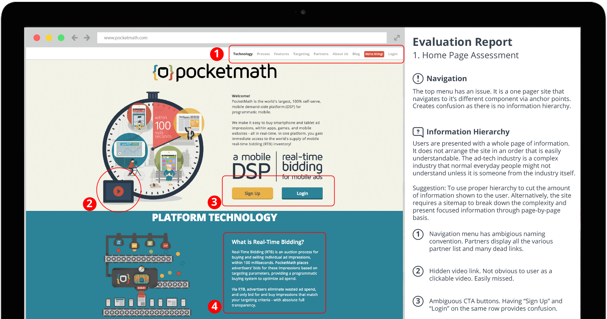
At the outset, I conducted a heuristic evaluation on the existing website and discovered many usability issues, broken links, and poor workflows. I also did a competitive analysis to better understand the ad-tech landscape and how information is presented online by the competition. I worked closely with the marketing, product, and sales team to understand their needs. Together, we built a set of user stories that I translated into a feature map.
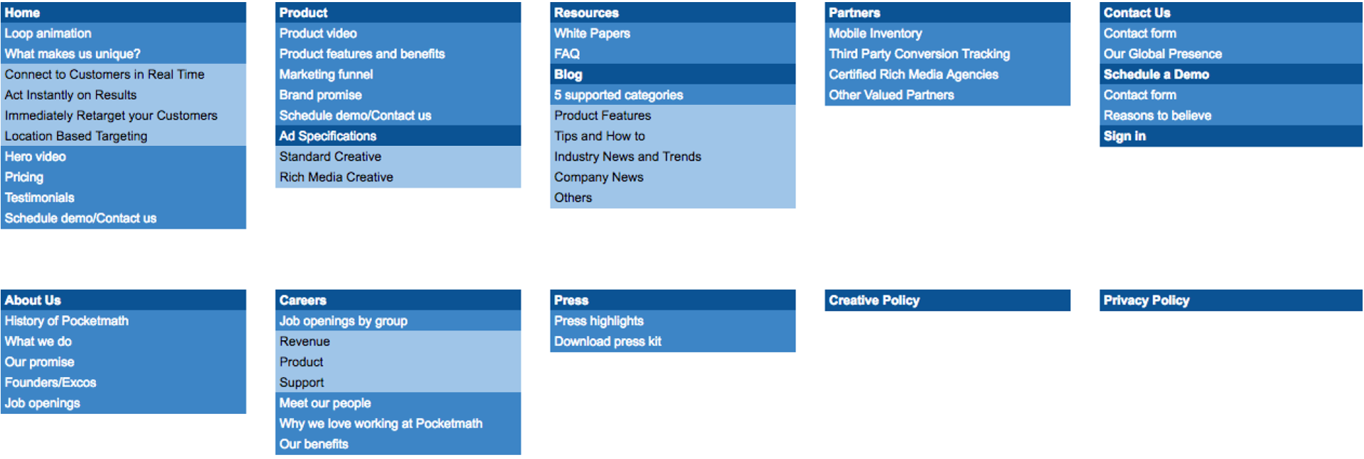
I conducted card-sorting exercises with internal users to establish the information architecture (IA). Using all the various arrangements created, I synthesized a grouping that had the most commonalities and drafted the initial IA.
Using the IA as a guide, I created the sitemap and tested it with internal users. This refined sitemap served as the foundation for creating the high-level design concepts that were, in turn, developed into wireframes.
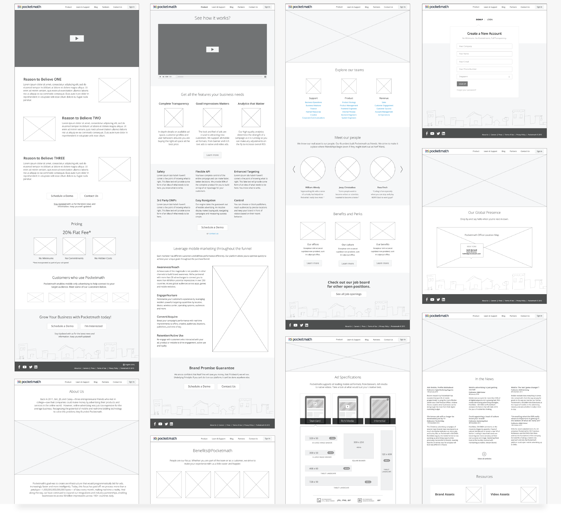
Based on the IA, I created low-fidelity wireframes, which were then used to gather comments during our focus group discussions. Using insights gathered from these focus groups, I built high-fidelity wireframes to chart and illustrate the entire sitemap - allowing stakeholders and partners to more easily visualize the entire overview of the website. Finally, the wireframes were used to craft the responsive view of the website when it is displayed on mobile devices (such as smartphones and tablets).
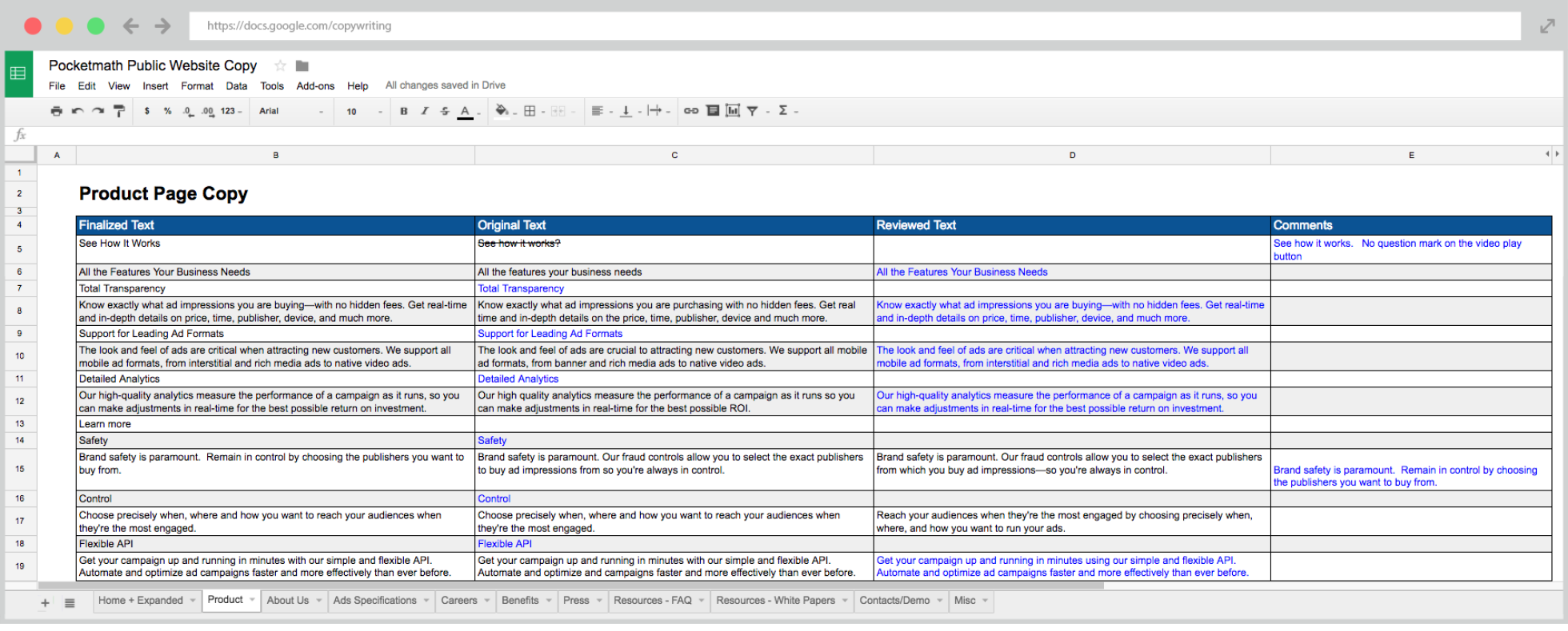
Using the wireframes for reference, I worked with stakeholders to translate their intents and reasons-to-believe into text for the website, which was later reworked for search engine optimization, SEO with a copywriter. The reviewed text was incorporated into the wireframes so as to provide better context of how the finished site might look and sound.
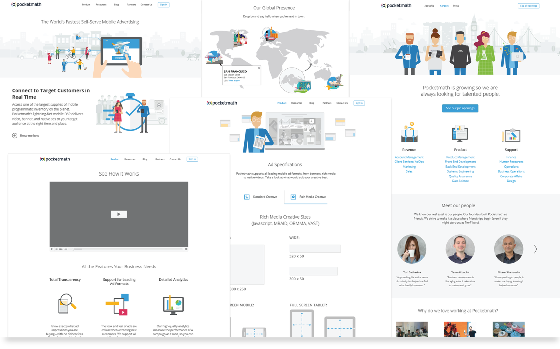
The Design Team applied the new brand treatment and created all the necessary assets for the developers to implement on the HubSpot platform. We were faced with many challenges while creating the new website on the HubSpot platform: new structure, analytic tags, design integration to support newsletters and blogs - as well as social media blasts - were all required. As a result, and in order to accommodate user testing and comments, the website went through a few iteration rounds.