• Creative Director

  • Branding

  • Mar, 2016

Pocketmath Inc. is a startup firm in the booming and volatile ad-tech industry with offices around the world (Singapore, San Francisco, New York, London, and Sydney). As Pocketmath has grown internationally, the company initiated a brand refresh exercise to enhance its brand equity and values - and to increase its brand awareness on the global stage. This effort proved to be a journey towards making the brand more personal, holistic, and integrated.


As the Creative Director and lead designer of the project, my role was to develop a strategy for the brand vision and to create design consistency across all of the various touchpoints. I lead a team of user experience and visual designers to create, develop, and deploy the new brand system. I worked closely with stakeholders to refine the selected design. The final brand system resides on a web portal that is easily accessible by everyone in the company.


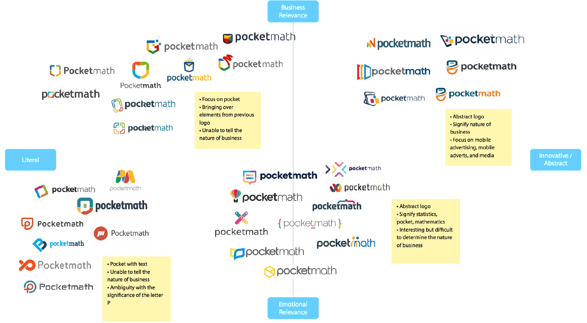
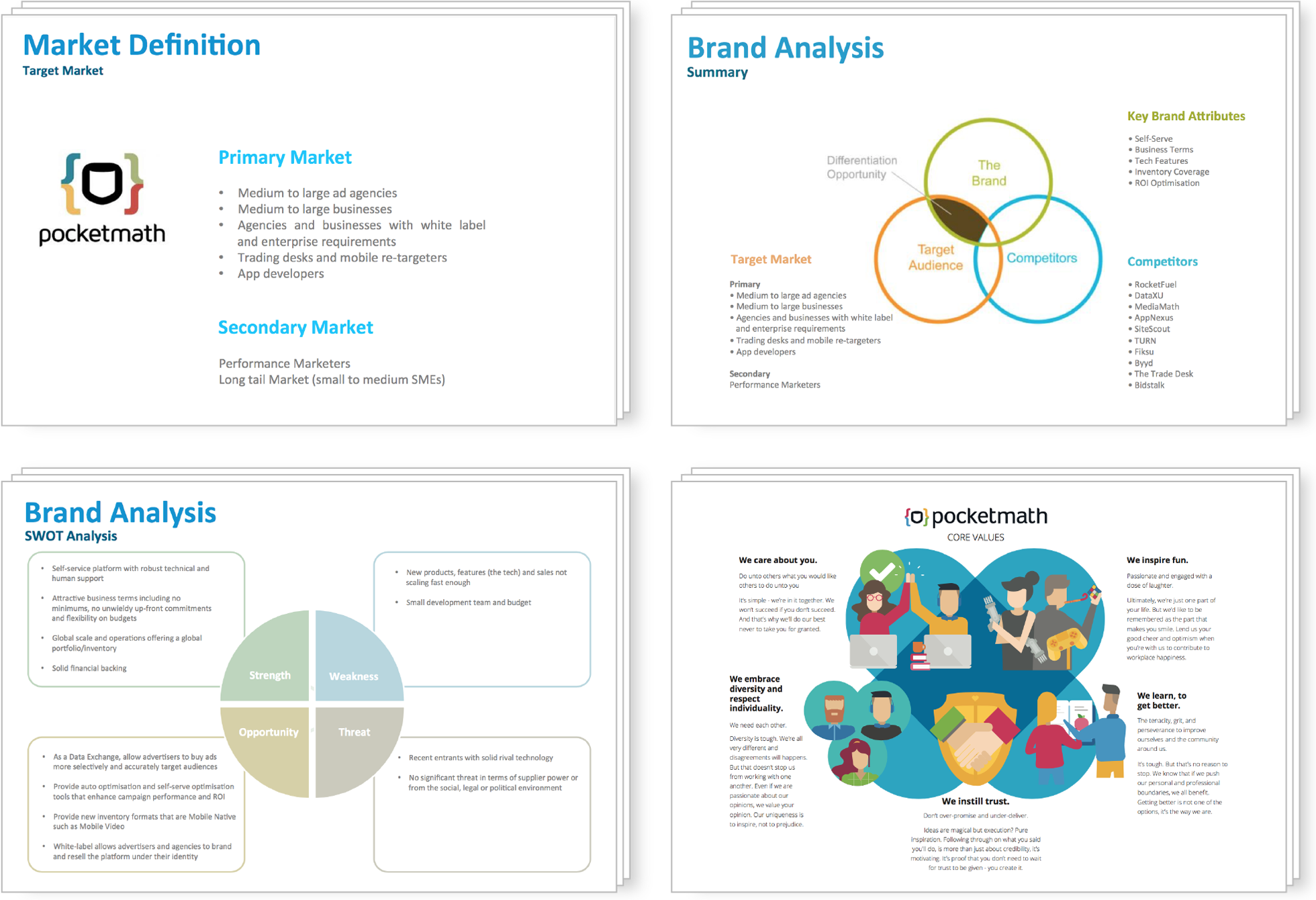
I conducted meetings with key stakeholders to align expectations and to set end goals and clear objectives of the re-branding exercise. I worked with a brand agency to analyze the current state of the brand, whose final report identified gaps and inconsistencies - setting the foundation for the re-design.


I lead a company-wide effort to identify and create the company's core values. We conducted focus groups to gather employee feedback, and using these insights, the team drafted a set of core values. The draft was tested and refined before being finalized as the core values used in the new brand.


I proposed a design competition and hosted the event on 99Designs, which yielded over 400 submissions - providing the Design Team with a huge pool of concepts and ideas. I worked closely with each designer to polish and refine their concepts, and the Design Team discussed, analyzed, and then selected two winning concepts, awarding the winners with a monetary prize.


After shortlisting 40 concepts, the Design Team mapped the designs onto a matrix landscape. From this exercise, we discovered four distinct groups - each with a different set of characteristics - leading us to realize that our design effort should not drift too far away from our existing brand identity. With this in mind, we decided to refresh the existing brand instead of reinventing a new design.

This brand exercise was the first time Pocketmath has ever seen such a comprehensive deep dive into its brand identity. The biggest challenge of the brand refresh was the logo: it took the longest amount of time to finalize. By collaborating with various stakeholder teams, we created a concept for the new brand logo, color palette, and all supporting visual elements, as well as brand stationary items. All concepts/prototypes were tested with internal staff and external customers.

Through independent research, I learned that web portals are commonly used across industries for housing brand platforms and making them available to everyone in a company. Based on the insights gathered from the focus groups, I created a feature list and used it to build the information architecture (IA). I created wireframes for the site to better communicate the design intent, as well as to gather user comments.

The team expanded the brand elements into all possible touchpoints and created toolkits ranging from documents and presentation templates, communication templates, email signatures, newsletters - and even social media designs. All toolkits resides in an intranet portal known as the Brand Experience Center that is coded in HTML and maintained by the Design Team. And because it is housed on the intranet, all employees can easily connect to and use the site. I also conducted brand training sessions that were recorded and made available on the site as refresher courses for current employees and orientation information for new employees.


Top