• ID Designer

  • CMF

  • Sept, 2009

The OSIM Color Strategy exercise was an initiative by the Design Team to create new color schemes to enhance the product palette. The team faced challenges when using the existing brand colors - colours that were stale and bland. The intention of the color strategy exercise was to introduce brighter and more contemporary, lifestyle color schemes into the company's products.


I worked closely with the Design Manager to research and propose new color schemes. We collaborated with color consultants to evaluate the existing colors, as well as to analyze trends and to validate the new lifestyle colors. The most rewarding experience of this project was learning to forecast colors from trends.

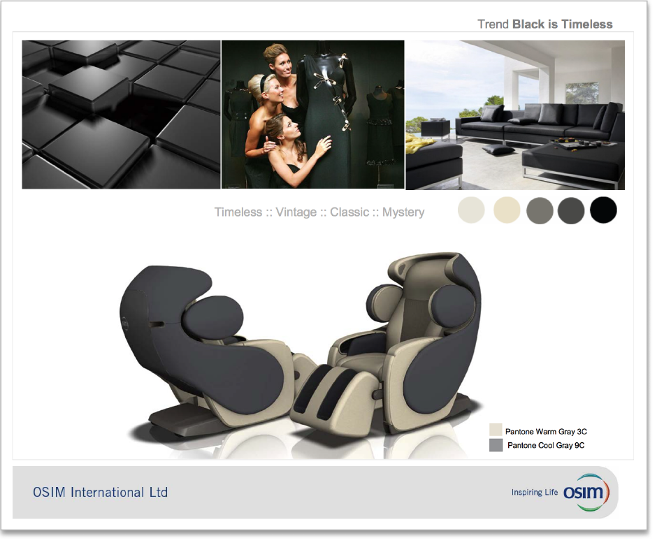
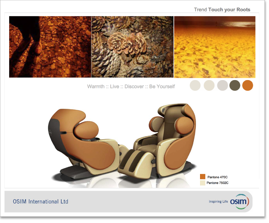
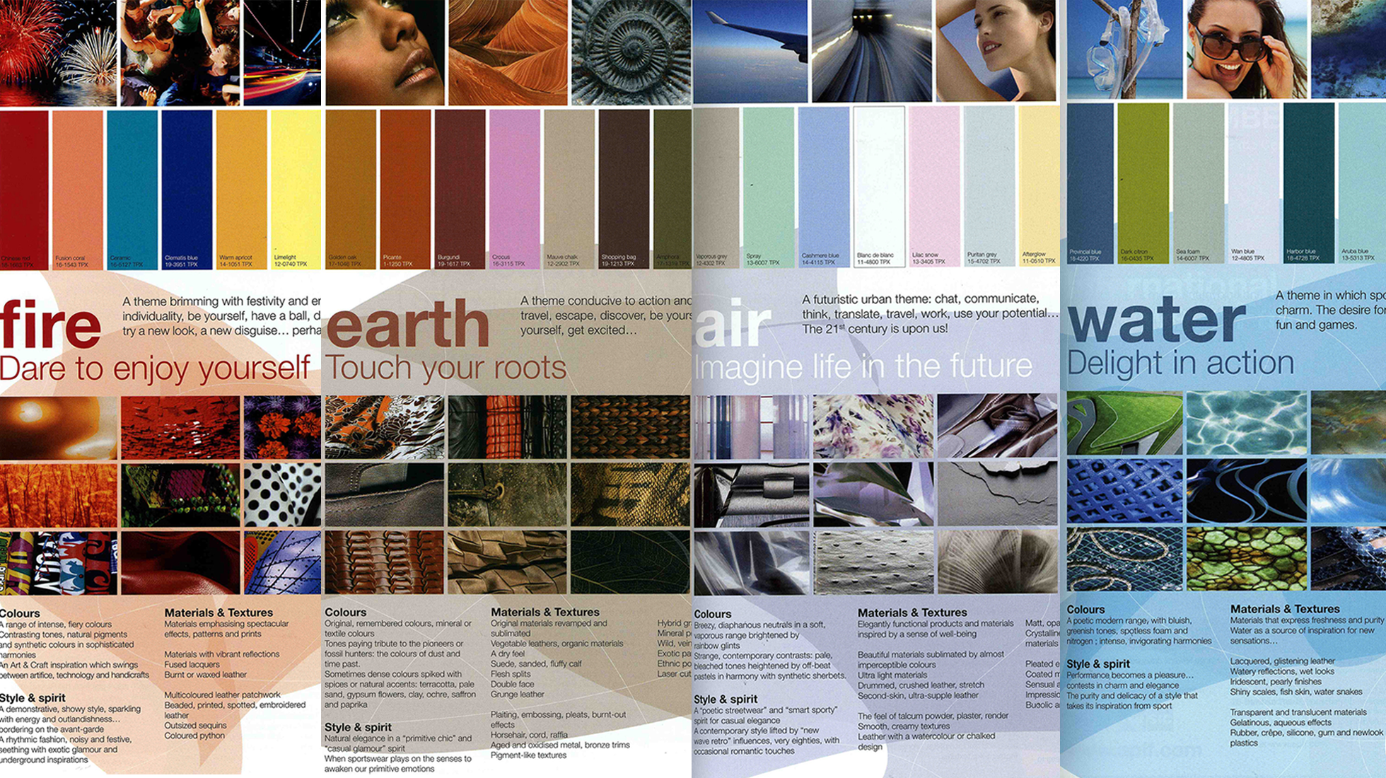
The idea for a color strategy started when the Design Manager and I attended the Asia Pacific Leather Fair, APLF, 2010 in Hong Kong. We were inspired by a fashion speaker from Peclair Paris who presented on the topic of fashion trends. From there we asked ourselves, how can fashion as a lifestyle be translated in product design? We worked with fashion consultants to identify lifestyle trends that would have the potential to influence home interiors.

We selected the Earth theme as the direction to pursue and to further develop into personas. I lead the workshop in which we created the new persona, fleshed out the details and developed user stories to support these personas. We used the references from the trend research to develop a palette of earth-tone colors to compliment the new personas.

I created moodboards to simulate how the colors used in the personas would look on our OSIM products - an exercise that helped to provide context for the color usage. The moodboards created buzz and excitement amongst stakeholders, and the Design Team was awarded extra budget to prototype some of these products in actual colors and materials.


I worked with Clariant ColorWorks to benchmark and to validate the new product colors with global trend colors. The analysis report favored the new color palette and made OSIM's upper management realize that the company was in need of a brand refresh.


The design initiative to introduce lifestyle colors became the foundation of OSIM's new rebranding effort. All stores and brand related touchpoints and collaterals were refreshed into the Earth tone series, and all future massaging products launched used this color scheme.


Top